Hey! Banco
Hey! Banco
HEY! Banco — Mobile Banking App UX
Onboarding & Navigation Optimization
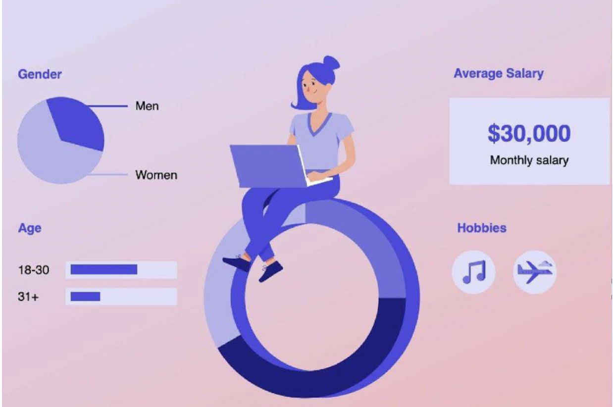
Hey Banco is a fully digital bank for young adults in Mexico, it was conceived as a new product against the old Legacy app of Banregio. With no physical branches, the mobile app is the only place where users onboard, understand the product, and build trust.
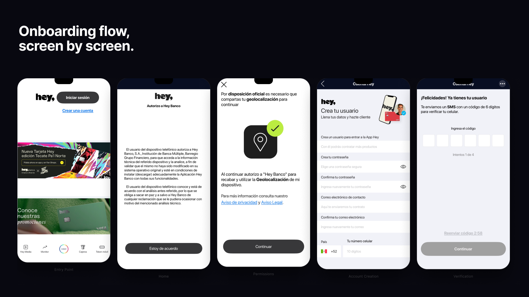
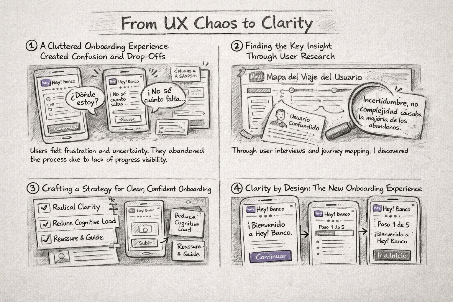
The original experience exposed users to too much information too early, creating confusion and drop-off during onboarding. This project focused on simplifying flows and restructuring navigation to help users complete core banking tasks with confidence—without removing features.
Outcome: clearer onboarding, reduced cognitive load, and a smoother first-time experience.
My Role
UX/UI Designer — Onboarding & Global Navigation
I led the UX/UI design for onboarding and overall app navigation, defining the foundation that connects all products within the app. I collaborated with a cross-functional team of six designers responsible for individual product areas, including debit and credit cards, rewards, and insurance products, ensuring a cohesive and intuitive experience across the platform, alongside 2 stakeholder, 1 product owner and additional two financial advisors.
From UX Chaos to Clarity
Chaos — Confusing experience
Insight — User research
Structure — UX strategy
Clarity — Redesigned flow
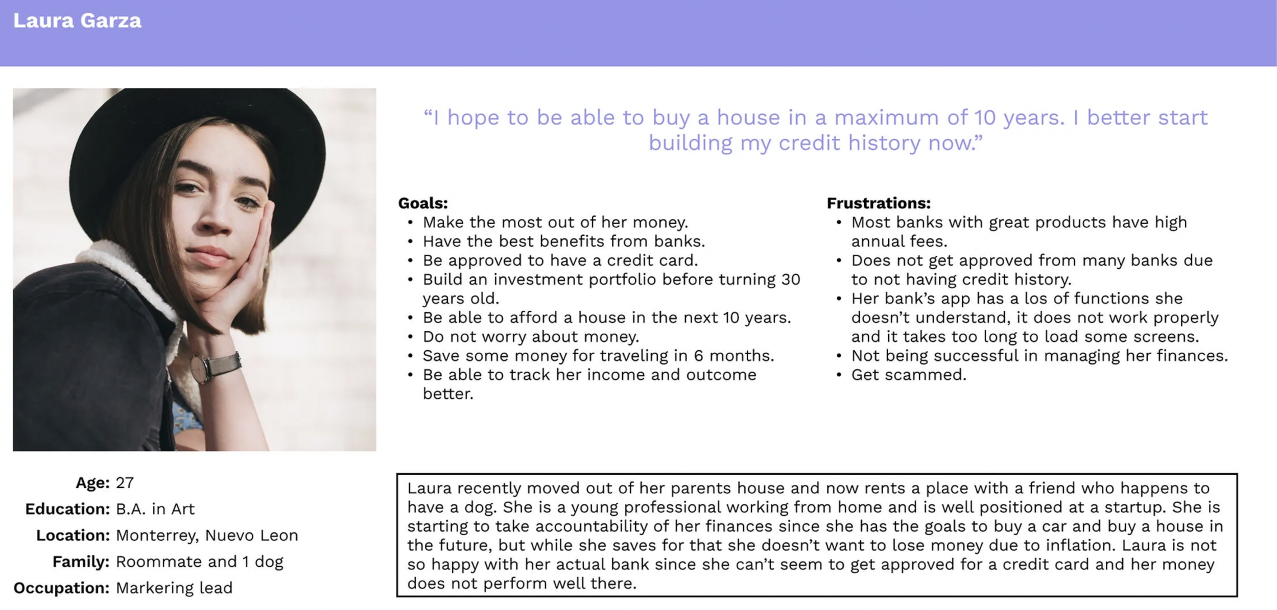
🧠 Research & Key Insight
Why users abandoned onboarding
Research Methods
🗣️ User interviews
📋 Surveys
📊 Funnel & drop-off analysis
We combined quantitative data with qualitative insights to understand both usability issues
and emotional friction during onboarding.
Key Findings
63%
Didn’t know how far along they were in onboarding
58%
Felt confused by documentation requirements
47%
Felt overwhelmed during account setup
Core UX Insight
Users weren’t abandoning onboarding because tasks were hard —
they were abandoning it because they felt uncertain and lacked confidence.
:Onboarding wasn’t failing functionally. It was failing emotionally.
Ideation & UX Strategy
Using insights from research, we facilitated collaborative ideation sessions to explore how onboarding and navigation could be restructured to reduce uncertainty and cognitive load.
The objective was not to design screens immediately, but to challenge assumptions, explore multiple structural approaches, and validate direction early—before committing to high-fidelity solutions.
Key Focus Areas
Reducing cognitive load during first-time use
Improving onboarding clarity and sense of progress
Simplifying navigation hierarchy across products
Creating predictable, easy-to-follow user flows
Activities
Crazy 8s sketching sessions
Rapid wireframe ideation
Flow and information architecture exploration
Group critiques and iterative refinement
This phase allowed us to move from problem understanding to a clear UX strategy, aligning the team around a shared direction and setting a solid foundation for detailed wireframes and interactive prototypes.

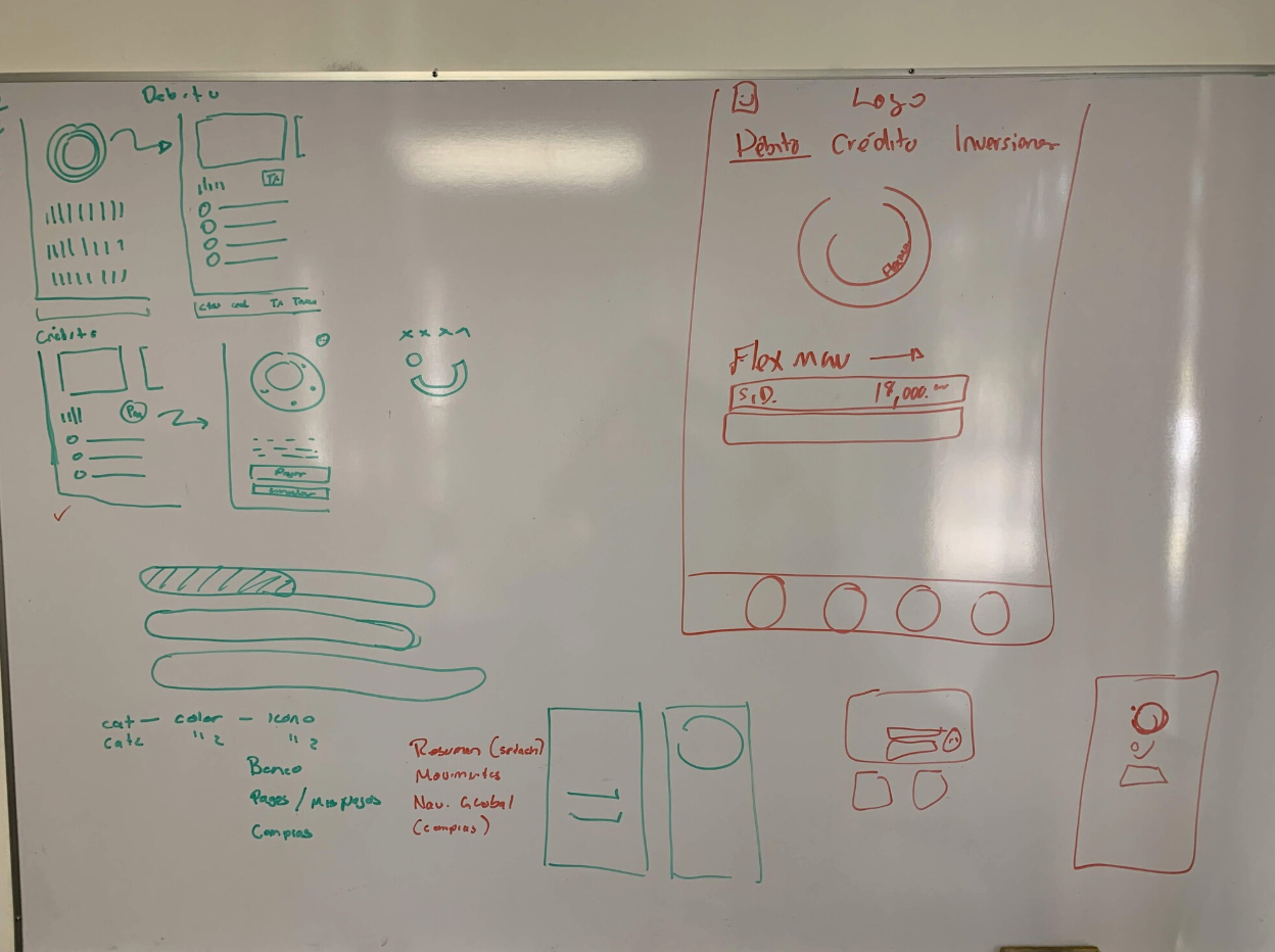
Wireframing & Early Validation
After defining the core UX direction, I translated key ideas into low-fidelity wireframes and interactive flows to validate onboarding logic, navigation structure, and task clarity before moving into high-fidelity UI design.
At this stage, the focus was on solving usability and clarity issues at a structural level—reducing risk and avoiding unnecessary visual rework later in the process.
Key Goals
Validate onboarding flow logic and progression
Reduce cognitive load through step-based interactions
Simplify navigation hierarchy across products
Improve task clarity and predictability
Approach
Low-fidelity wireframes
Flow diagrams and interaction mapping
Rapid iteration and internal reviews
Early usability validation
Focus on experience and usability, not visuals yet
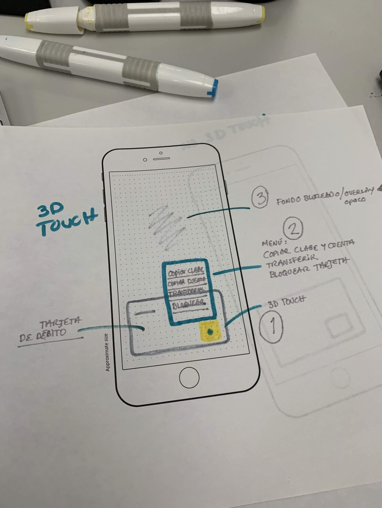
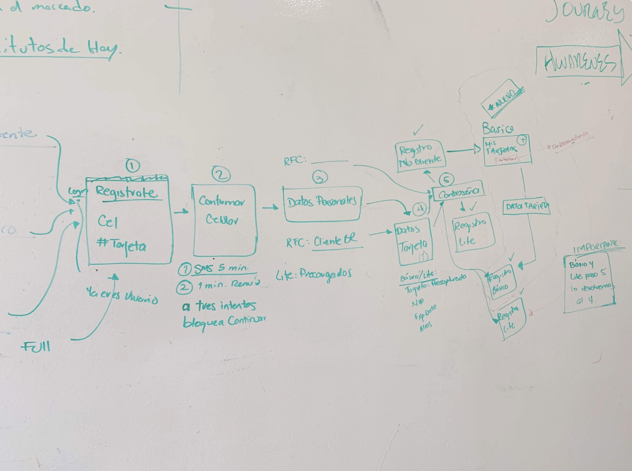
Wireframes example

🧪 Usability Testing Results
✔ Onboarding clarity
✔ Navigation discoverability
✔ Task efficiency
✔ User confidence
Real users tested flows to validate clarity, effort, and confidence.
Key User Concerns
Welcome screen needs clearer purpose
Stronger visibility of security and data protection
Mixed expectations around promotions
Faster access to security token needed
Clear step indicators required
Visibility of digital signature for legal compliance
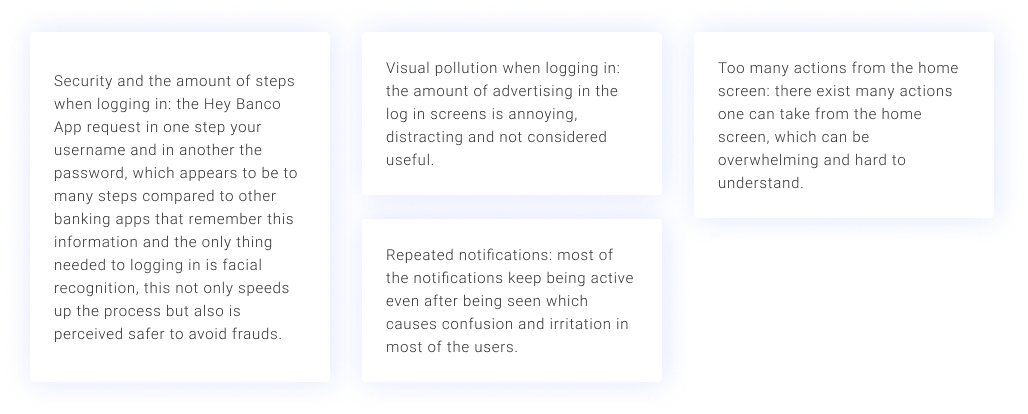
Testing helped us balance clarity, trust, and compliance—without compromising usability.
Testing Focus
What we learned (Honest frictions)
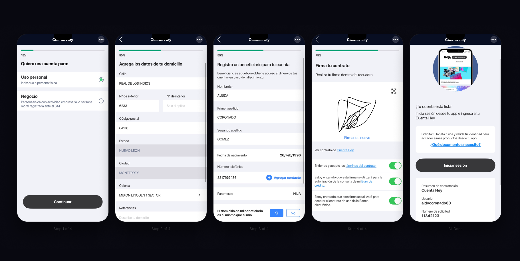
Some Before Screens (For Testing)


✔ Faster onboarding
Users completed flows with fewer errors
✔ Reduced uncertainty
Progress indicators increased confidence
✔ Better discoverability
Navigation changes surfaced features earlier
✔ Higher trust
Users felt more comfortable completing tasks.
What improved (Big wins)
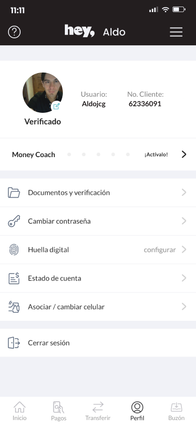
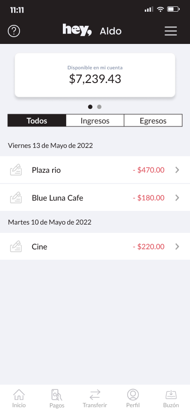
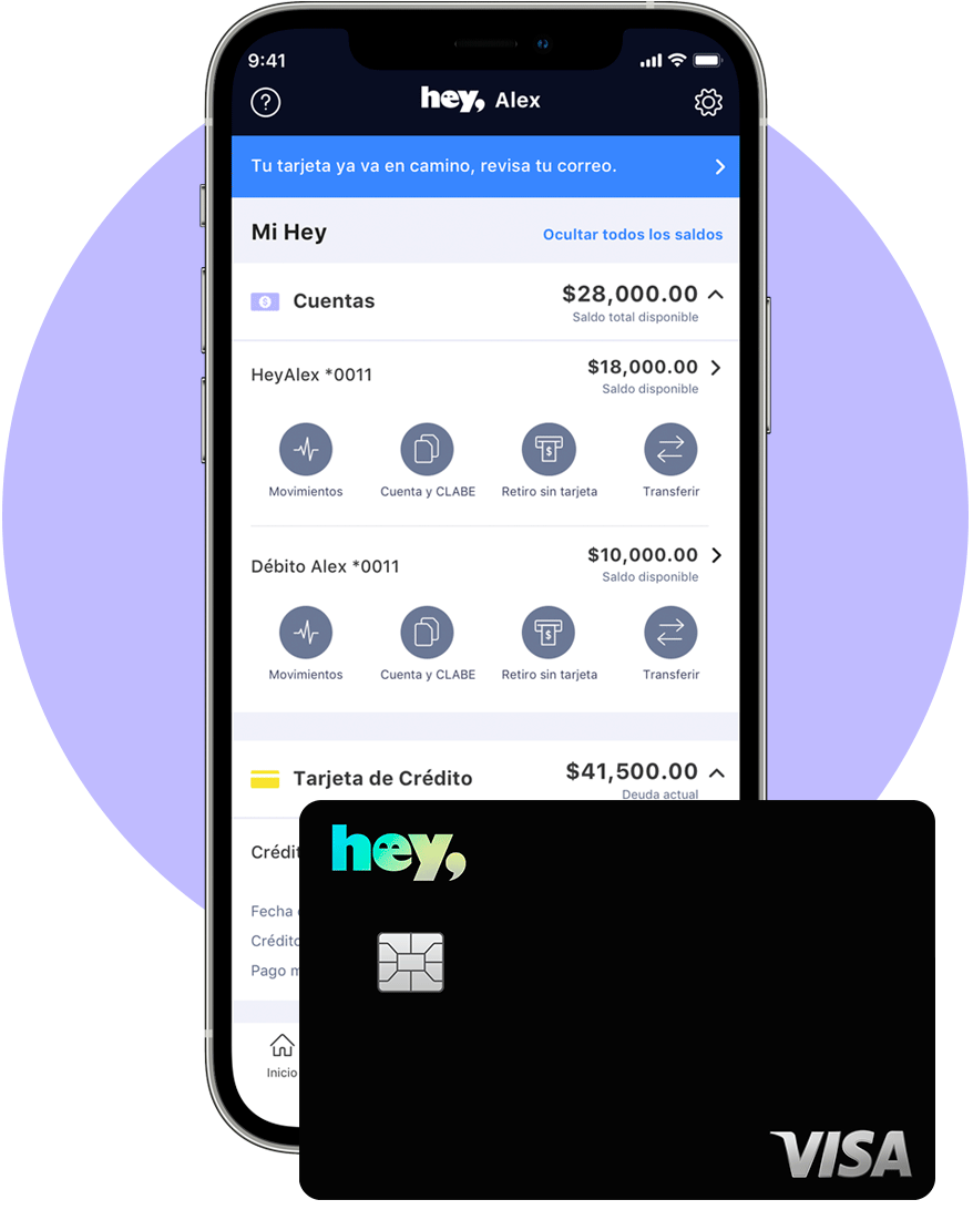
Final Product after second testing and Takeaways.
The redesign of Hey! Banco's digital banking experience, resulted in 20% higher user retention and 30,000+ new accounts post-launch.
By restructuring the information architecture and clarifying key user flows, the experience became faster to complete and more reassuring — reducing drop-off and building the trust users need to commit to a new financial product.
Impact
Faster onboarding completion with lower abandonment
Reduced confusion and hesitation at critical decision points
Higher task success rate and stronger first-time user confidence
What this reinforced: In fintech, designing for emotional clarity and trust is just as important as designing for usability — and it's what moves the business metrics.